Case study · Website · Redesign
30 Day Habit.
A blog about 30-day experiments, rescued from an expired Squarespace site and redesigned as a magazine and a logbook. Honest about what worked, and about what failed.
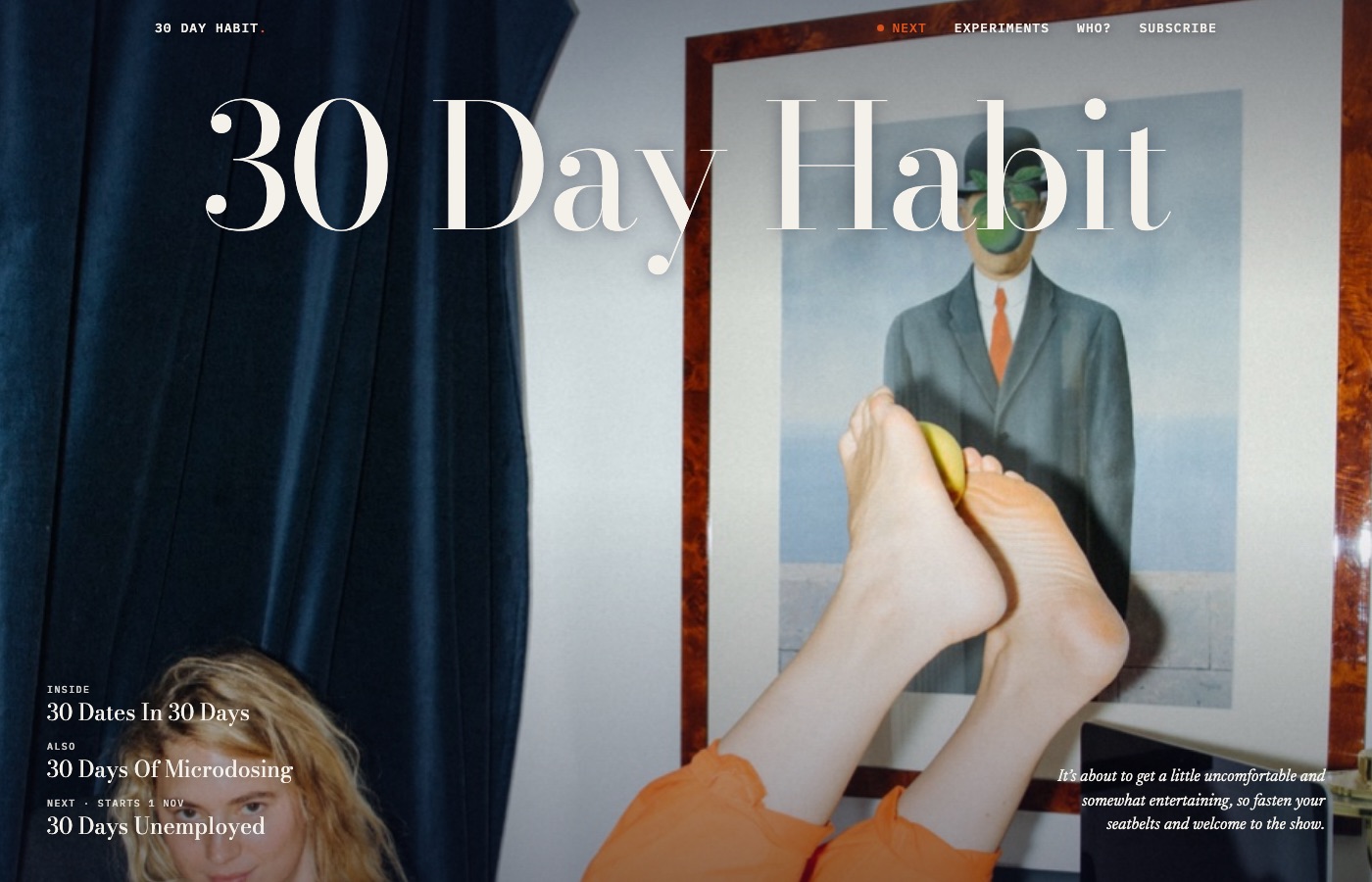
The challenge
An expired site with three new jobs.
The Squarespace subscription had expired and the export no longer worked. The posts were only reachable inside the editor. At the same time, the site had three jobs: show writing in job applications, be the home of a newsletter, and serve as a UX course project.
Show who you are in one second, and be honest about what failed.
Audit
What went wrong on the old site.
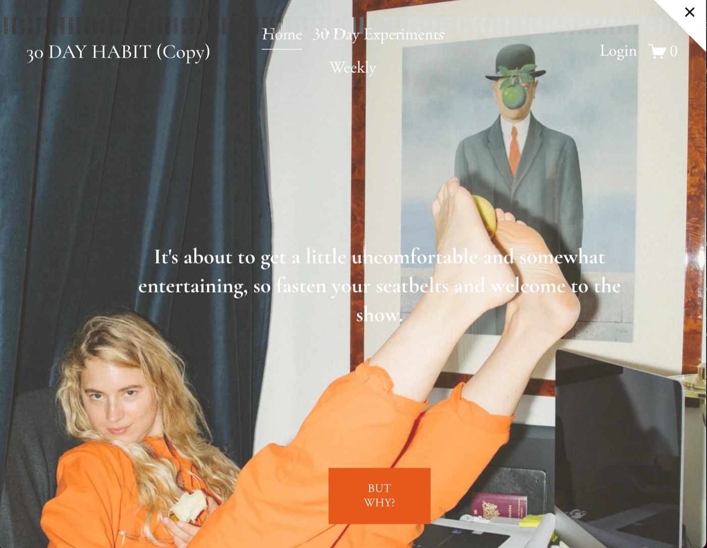
- "(Copy)" in the logoA leftover from a copied template, visible at the top of every page.
- A login and a cartOn a blog with no shop. Noise that raises questions.
- Centred long-form textHard to read for 1,500-word stories.
- Four near-identical cards per seriesParts I to IV as separate blocks, with nothing showing they belong together.
Design process
Too safe at first, then three directions.
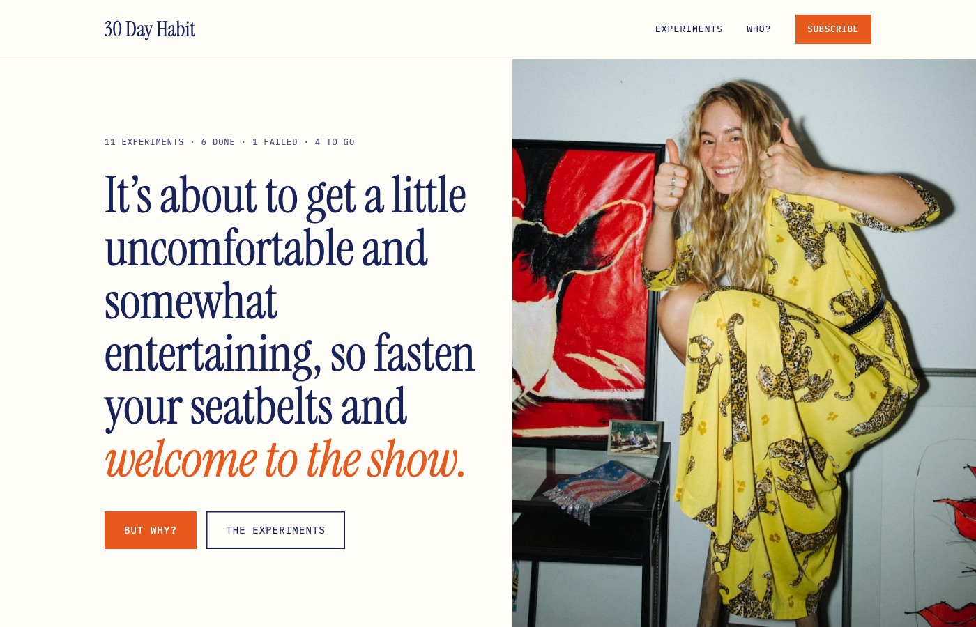
The first version improved the old site but still felt like a template: the quote shouted and the page read as separate blocks. So three directions side by side, with the real photos: a magazine cover, a logbook on grid paper and a bold graphic option.
Design decisions
Every choice has a reason.
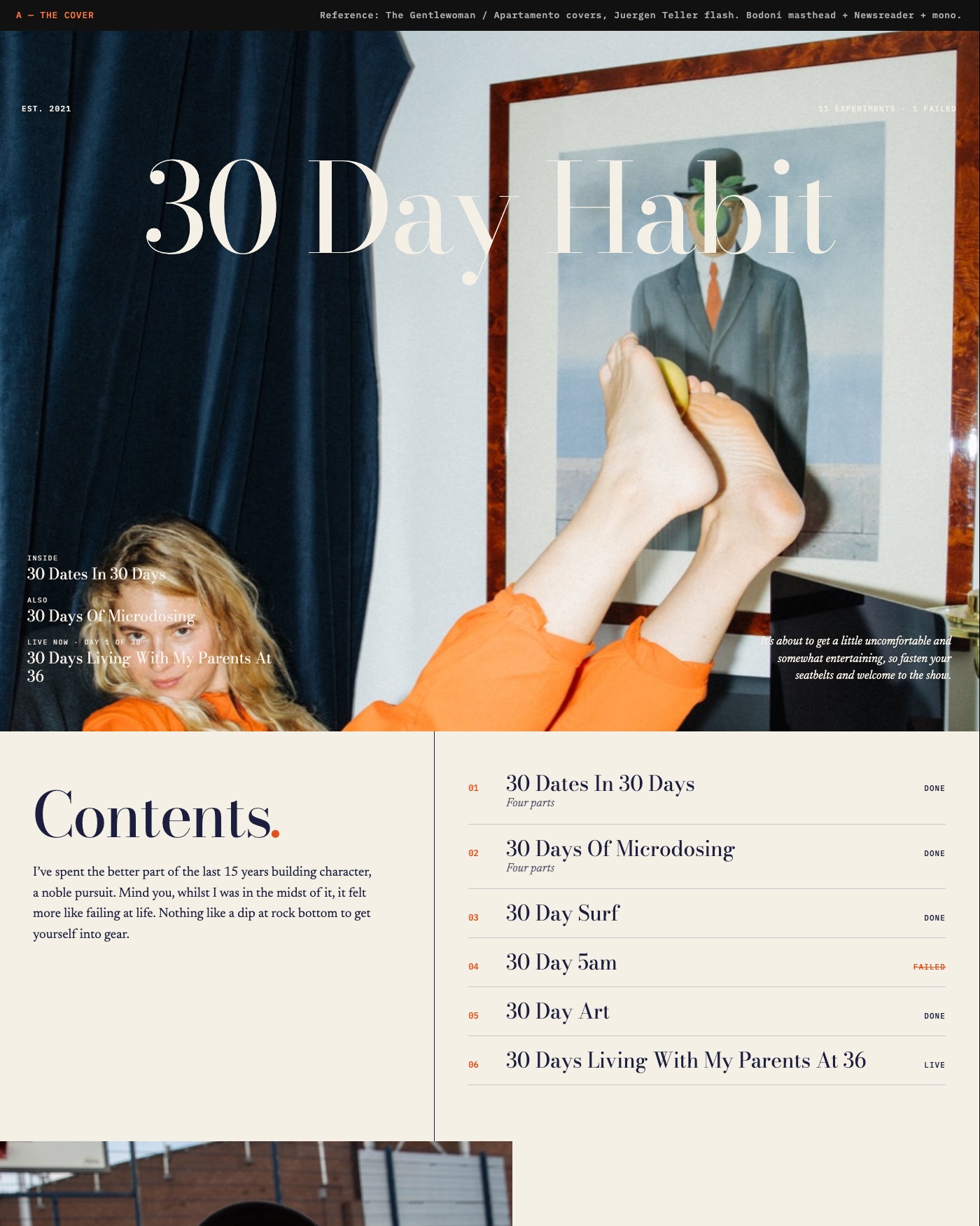
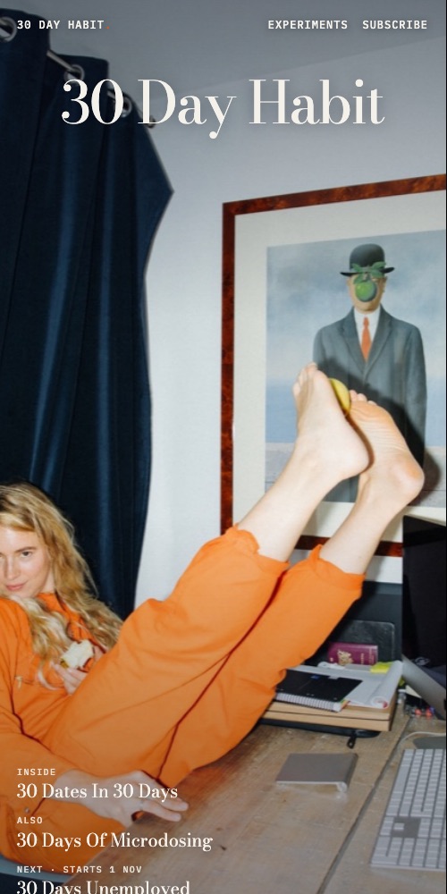
The homepage as a magazine cover
A large title over a full-bleed photo, with the content as "cover lines".
WhyIn one second you see who writes it and what's inside. The logbook starts underneath.
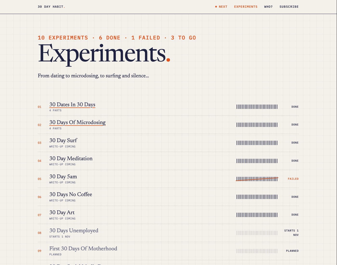
Thirty ticks per experiment
Every experiment shows its 30 days: filled is done, struck through is failed, faint is planned.
WhyHonesty about failure lives in the main navigation, not a footnote. It's also the site's recognisable signature.
A live experiment that updates itself
The running experiment counts up a day every day, without rebuilding anything.
WhyThe homepage changes daily. That gives readers a reason to return, and the newsletter a running story.
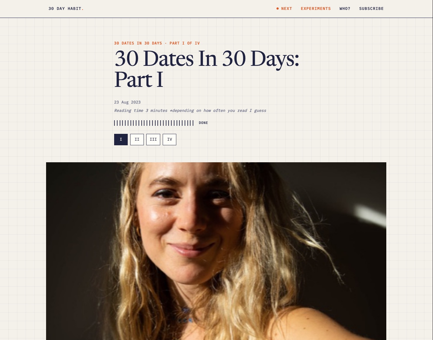
One page per story, with its own address
No dynamic page, but a fixed page with a clean link and its own preview.
WhyThat link goes into job applications. It has to look right when someone shares it on LinkedIn or in an email.
Outcome
Magazine on top, logbook below.
The cover tells you who I am. Below, you read as in a notebook: experiments with their ticks, stories in calm left-aligned text and a clear order from part I to IV.
AI in my process
My words, smartly handled.
One hard rule: the AI never invents content. Every word is mine. The automation sits in everything around it.
- Step 1
Rescued
Eight stories copied word for word out of the editor, no retyping.
- Step 2
Style guide
A guide built from my own posts, so every edit still sounds like me.
- Step 3
Build script
A script turns each text into a page with its own preview.
- Step 4
Live
Online through Netlify, on its own domain.
The original texts are kept untouched. Edits live separately and only go online with my approval.
Result
Where it stands.
- A live site at 30day-habit.com, with no subscription costs
- Its own visual language: the cover, the logbook and the ticks
- A system for newsletter, Instagram and site from one text a week
- A documented design process for the UX course
What ongoing care does next
The photo film strip on the homepage is heavy on mobile data, so smaller versions of those photos are first on the list. Then a privacy-friendly counter, to show how many people read it. Exactly the kind of small improvements every care plan includes.
Contact
Your story online too?
Let's talk.
An intro call takes fifteen minutes, no strings attached. Or just call: +31 6 46 28 62 00.
hallo@studiorttr.nl