Case study · Web shop · Brand
Haul & Stash.
A vintage web shop that feels like discovering something, not scrolling a catalogue. From brand and homepage to a system that lets one person run the whole shop.
The challenge
Selling vintage online without the catalogue feel.
Selling vintage online means fighting commodity pricing, algorithms and the sameness of Depop and Vinted. Haul & Stash sells at most 20 pieces at a time. Scarcity is a choice here, not a problem.
And everything had to work for one person: no studio, no photographer, no budget.
Design a shop that feels like discovering something, not scrolling a catalogue.
Research
What others do, and why it doesn't fit.
- Depop and VintedGrids full of prices, no voice of their own.
- Big CartelTemplate feel. Fine for crafts, wrong register for curated vintage.
- Farfetch and VestiaireLuxury and editorial, but cold and transactional.
Good editorial sites slow you down and make you look. Buying vintage should feel like that. The design had to resist efficiency on purpose.
Brand
Brand first, screens second.
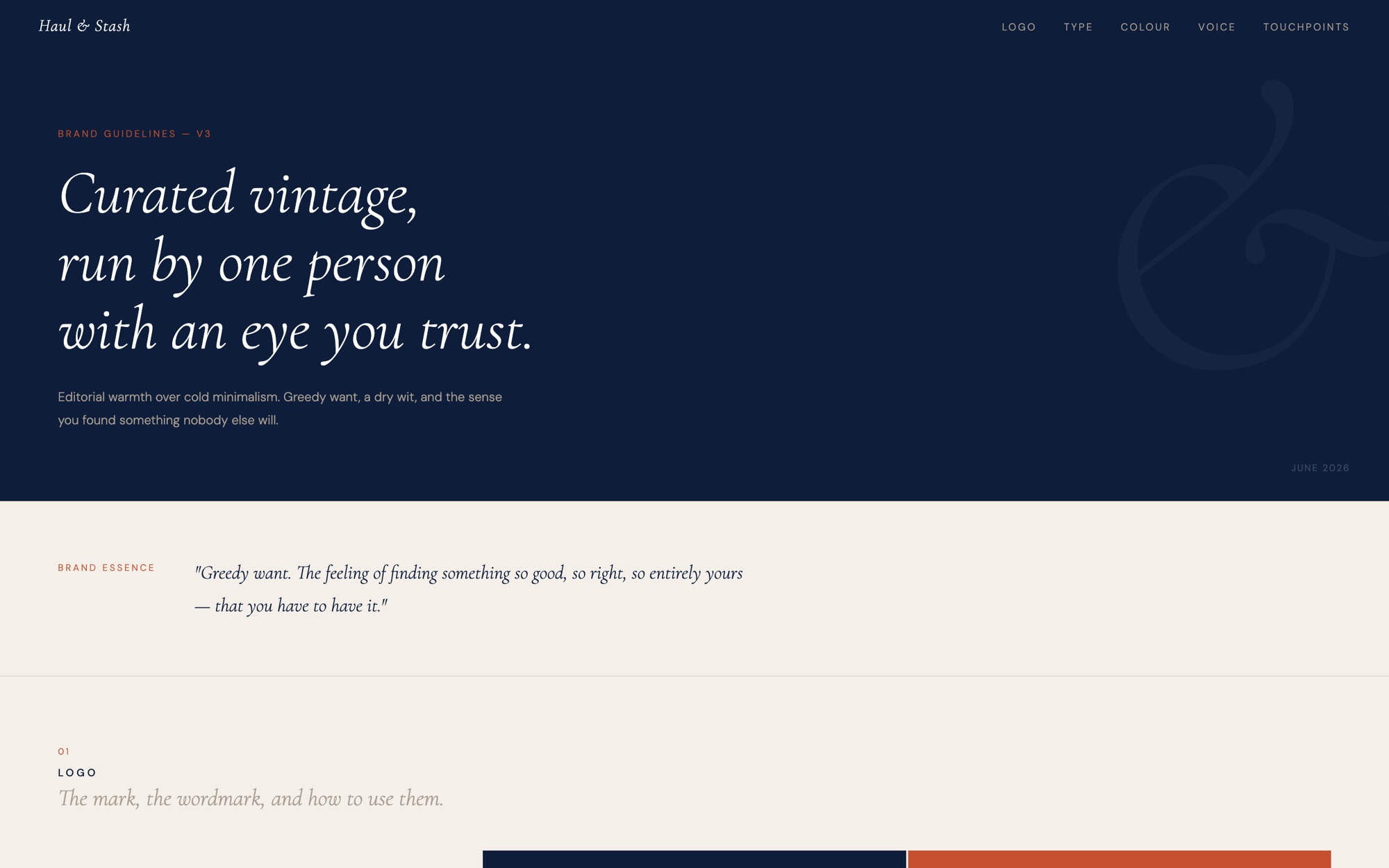
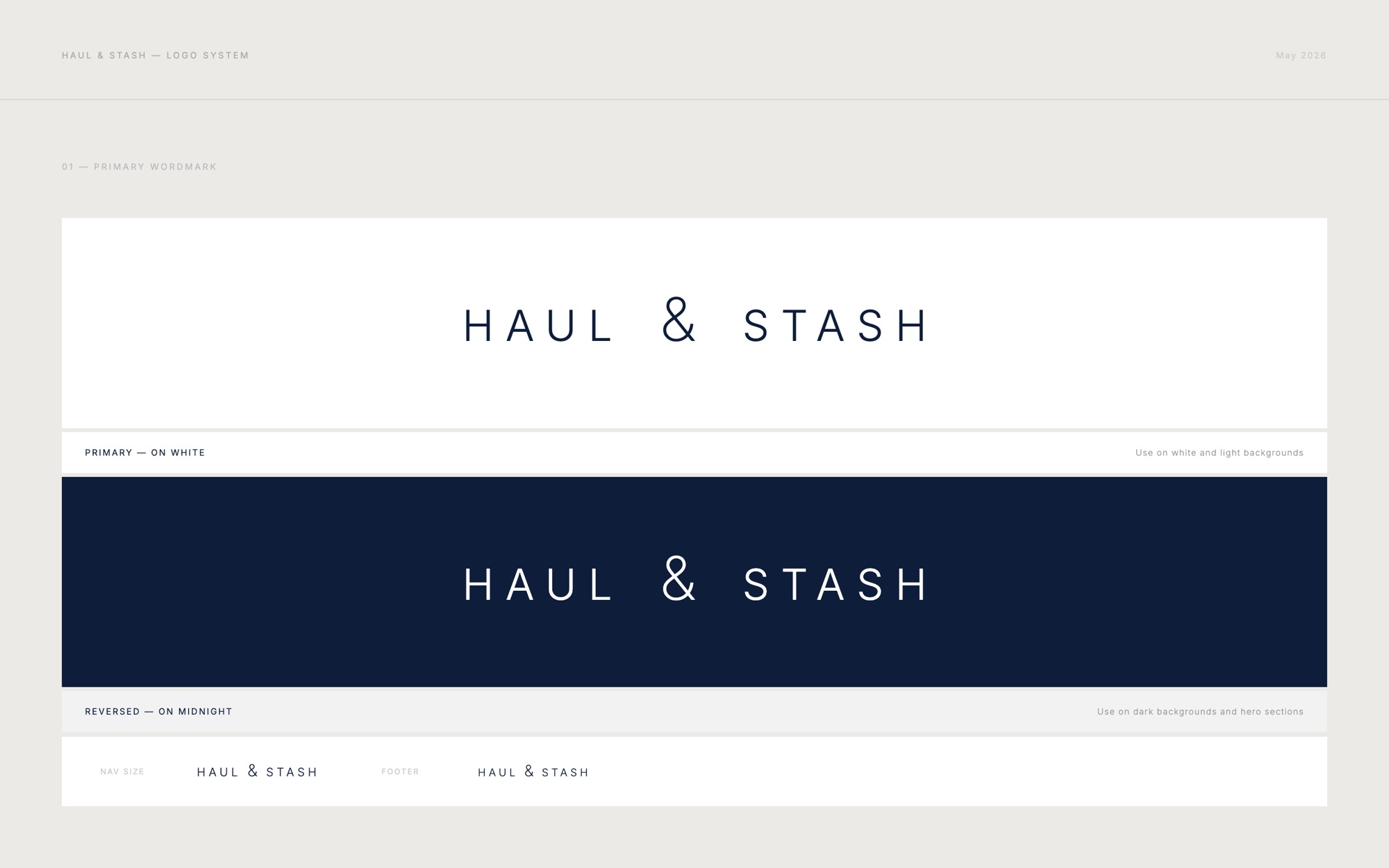
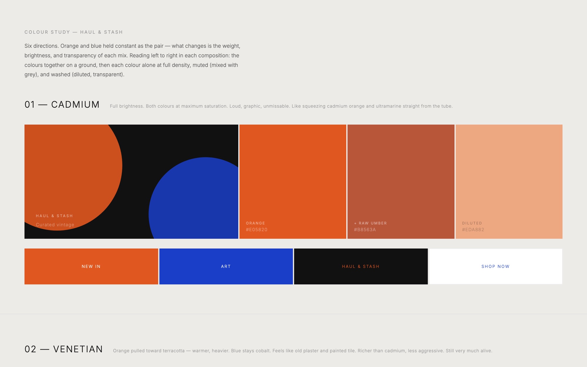
Three months of brand exploration before a single product page existed. Six colour directions, a wordmark where one character does all the work, and guidelines for voice and use.
Identity
Warm, not clinical.
Terracotta instead of bright orange. An off-white background. A classic italic for editorial moments, a calm sans for everything you need to read.
#F4F0E9
#0E1E3A
#C45030
#E5DCCD
#A89F92
Found things worth keeping.
Cormorant Garamond · headingsTo wear · To keep · Gone
DM Sans · navigation, prices, labelsDesign decisions
Every choice has a reason.
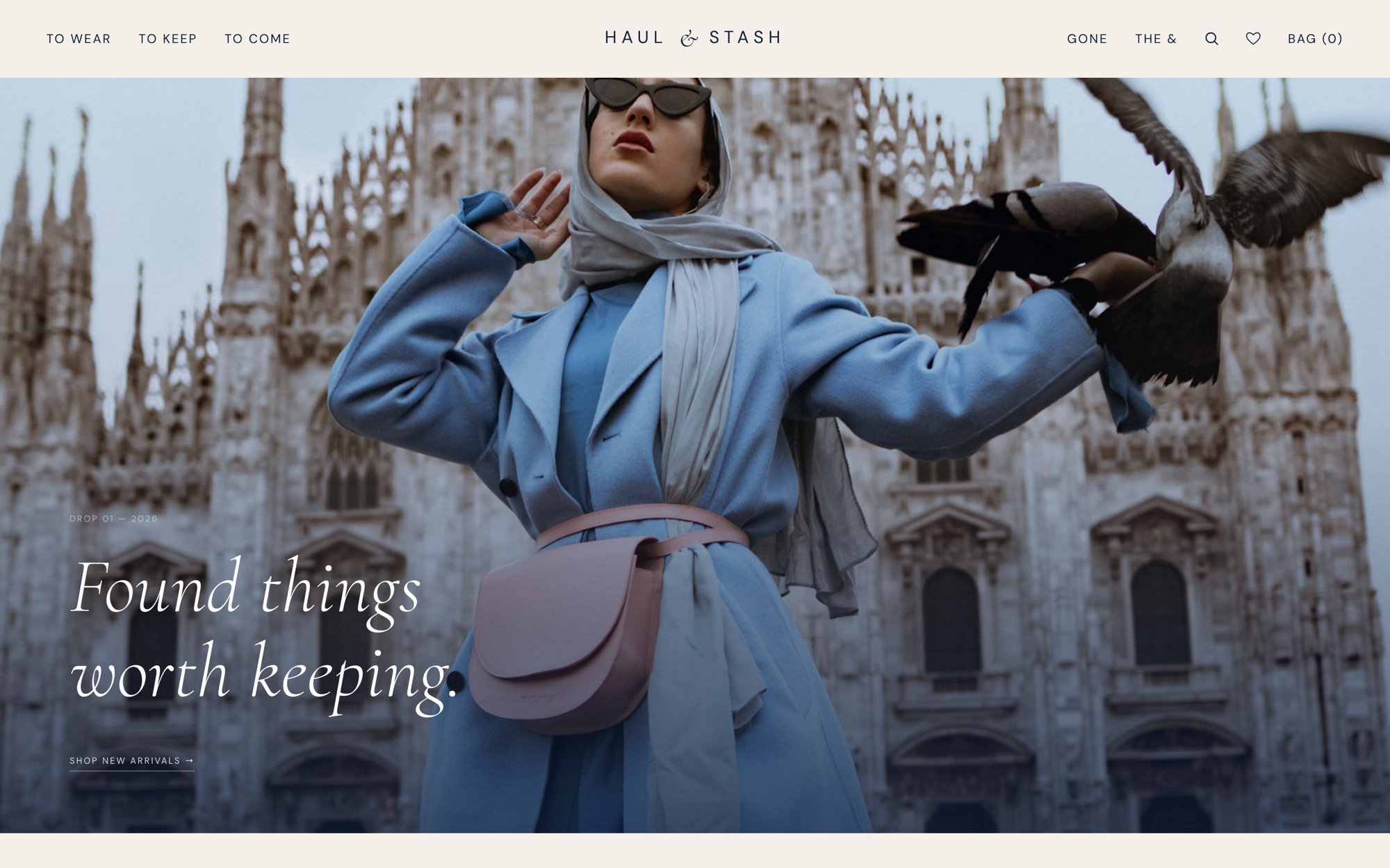
A full-bleed photo, text bottom left
The homepage behaves like the opening pages of a magazine.
WhyThe eye rests bottom left after scanning a large image. The photography gets to lead.
Image 58%, products 42%
Below the opening, a large image next to a short product list.
Why50/50 suggests both matter equally. The image is the main element, without the list turning into a sidebar.
Navigation that expresses intent
To Wear, To Keep and To Come instead of Clothing, Objects and New.
WhyYou choose what you want to do, not which box something sits in. To Come builds curiosity about what's next.
Sold pieces stay visible
Everything that has sold lives under Gone.
WhyMost shops hide sold items. Here they're proof of quality and pace: honest scarcity instead of fake urgency.
Iteration
From version 2 to version 3.
Version 2 was a clean 50/50 opening: image left, text right. Beautiful, but too static for a shop.
What worked in v2
- Clear typographic hierarchy
- Minimal, confident navigation
- The brand tone landed from the first screen
What didn't
- No products visible above the fold
- The text column felt underloaded
- Nothing pulled you further down the page
AI in my process
A custom automation system.
No Shopify, no developer. A system I designed, built and kept testing until it ran the same way every time. Every product gets the same care, and more time goes to finding beautiful pieces.
- Step 1
Photo
Product photo edited in Bazaart and dropped into a set folder.
- Step 2
Copy
Claude drafts a product description in the brand's voice.
- Step 3
Payment link
A Stripe payment link is created per piece.
- Step 4
Live
Product, photos and link appear on the site.
The AI writes a first draft; I read and edit everything before it goes live. Every product must have a name, era, origin, condition, size and price, so no listing slips through without context.
Outcome
Where it stands.
- A complete brand: logo, palette, typography, voice and guidelines
- Two homepage versions, with the trade-offs documented
- A site ready for launch, with no hosting costs
- A custom automation system: from product photo to a complete product page with payment link, ready for review
What ongoing care does next
The newsletter popup opens by itself after 4 seconds. That gets tested: does it help, or does it annoy the visitors who want to browse calmly? Before launch: real product photography, a mobile refinement and automatically marking sold pieces.
Contact
Want a site like this?
Let's talk.
An intro call takes fifteen minutes, no strings attached. Or just call: +31 6 46 28 62 00.
hallo@studiorttr.nl