Case study · Healthcare · Concept
Dental practice.
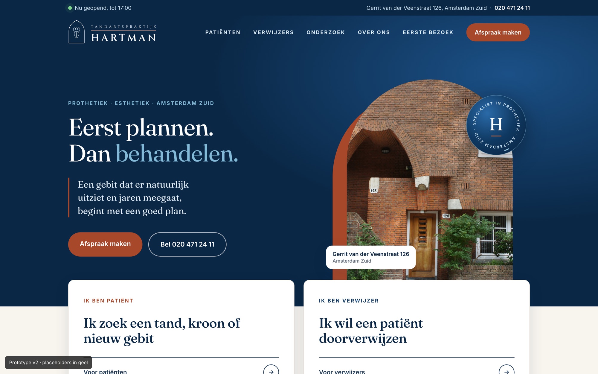
A specialist prosthodontics practice in Amsterdam, with one long page on a website builder. A concept with two clear entrances: one for patients, one for referring dentists.
The challenge
One page for two very different visitors.
Patients look for trust: who is the dentist, is the practice taking new patients, how do I book. Referring dentists want to know what they can refer and how. The current site gave neither a clear path, and referrals went to an email address with a typo.
Plan first. Then treat.
Audit
What went wrong on the current site.
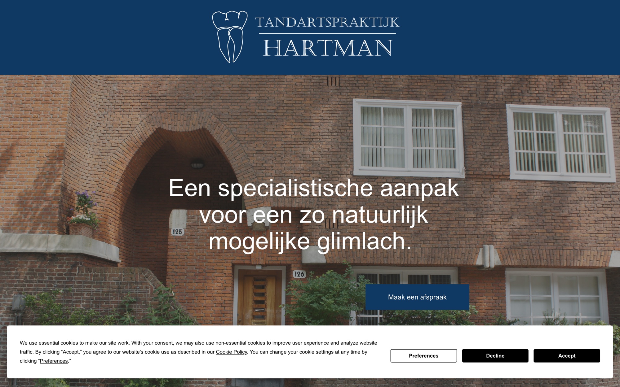
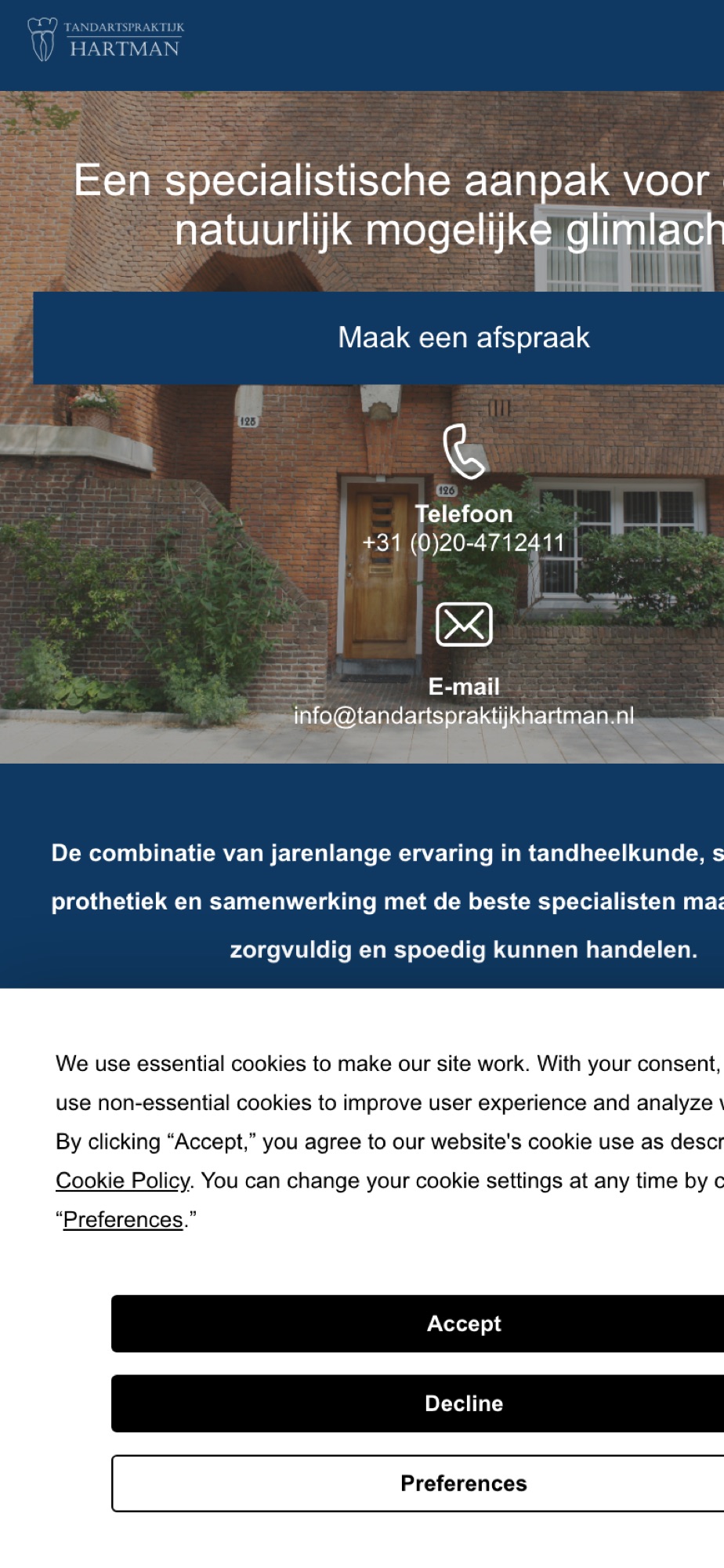
- Referrals to a wrong addressThe only instruction for referrers gave an email address with a missing letter.
- First questions unansweredNo information about new patients, the team, treatments or costs.
- Template leftoversTexts like "Name of reviewer" and "testimonial" were visible online.
- Privacy not in orderAn English cookie banner over a large part of the screen and a form with no warning about medical data.
Design decisions
Every choice has a reason.
Two doors on the homepage
Right after the opening you choose: I'm a patient or I'm a referrer.
WhyTwo audiences with different questions. Each gets its own route straight away, instead of one long page for everyone.
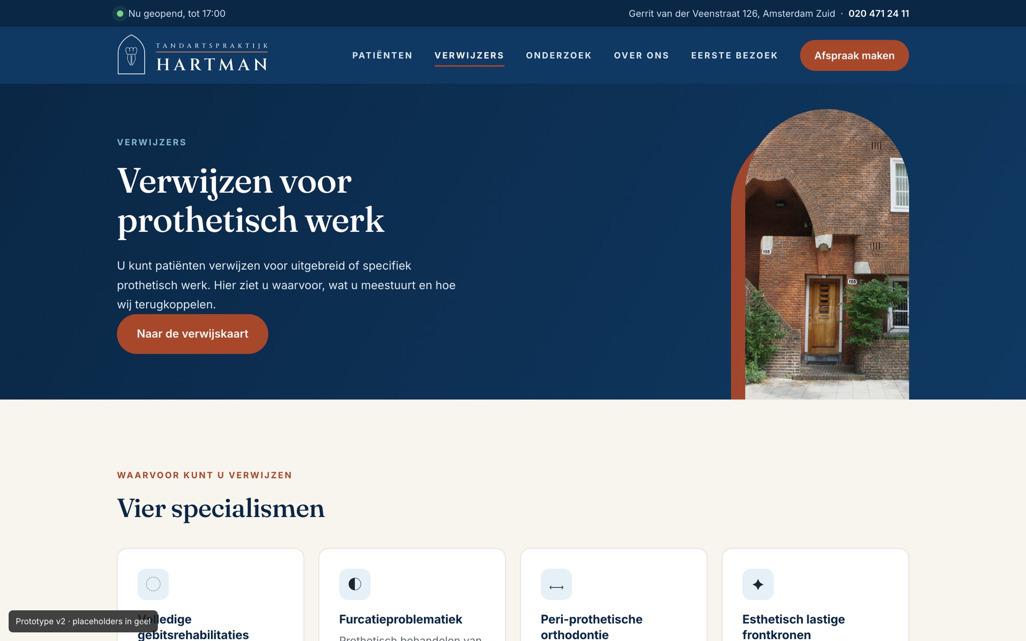
A dedicated place for referrers
What can be referred, three steps and a checklist to make the referral complete.
WhyA specialist practice runs on referrals. Comparable practices have no route for referrers at all.
The method as a timeline
"Plan first. Then treat." becomes a timeline that fills as you scroll.
WhyIt shows the specialist's care and sets the practice apart from a general dentist.
A brand from its own building
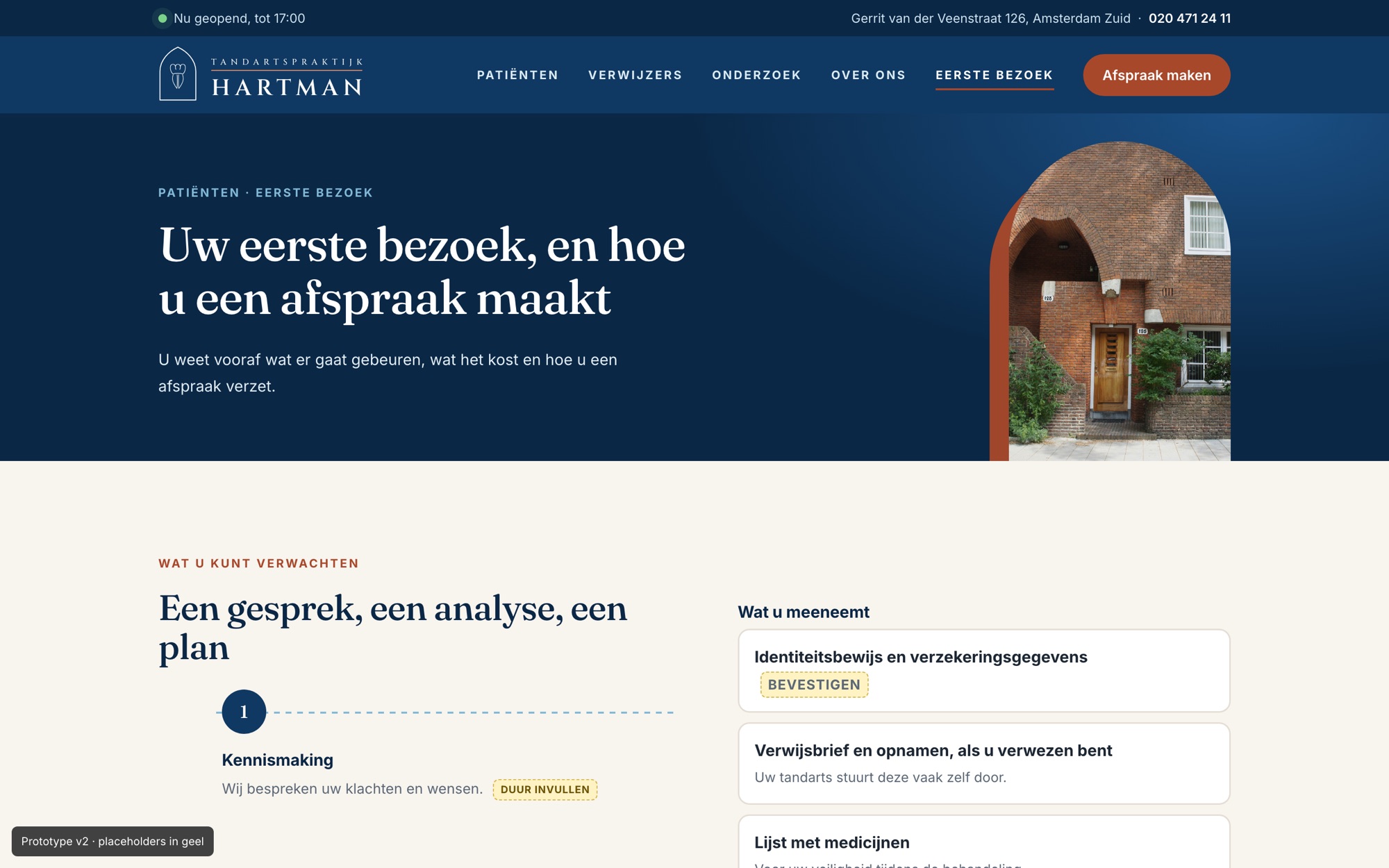
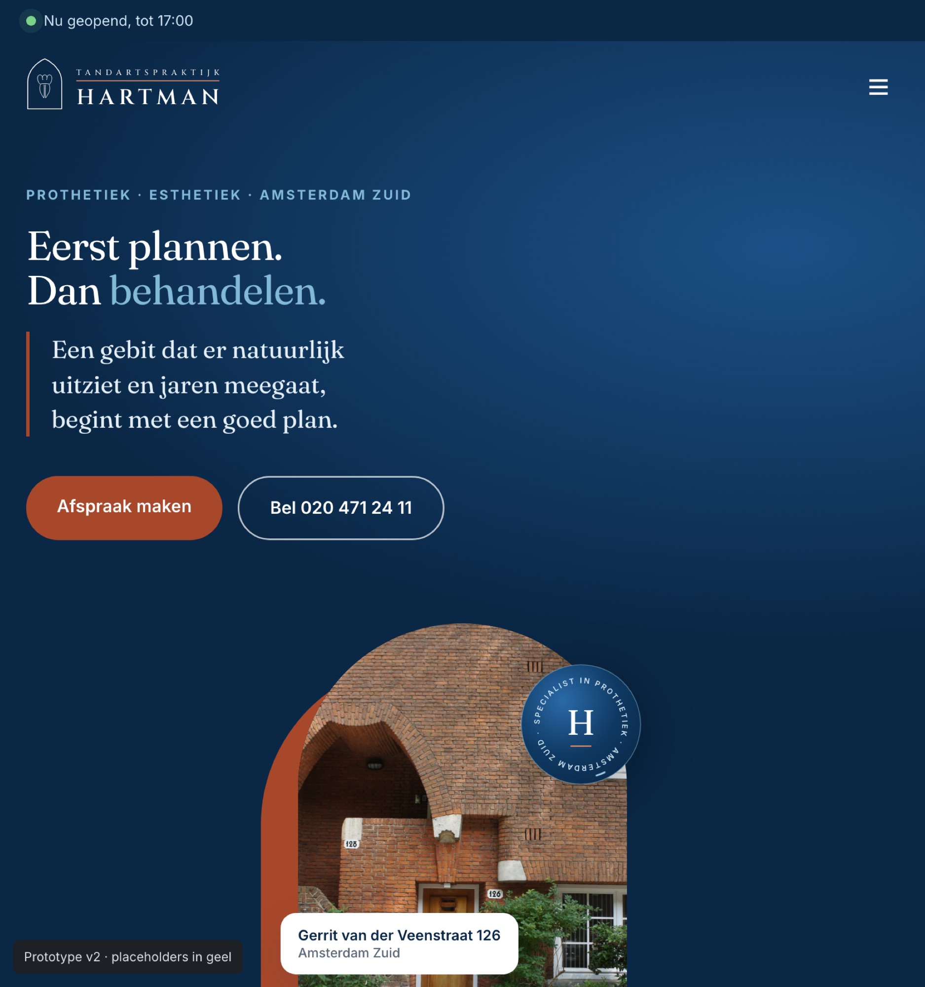
The brick colour of the facade and the arch of the front door as a recurring motif, with real photos instead of stock.
WhyRecognisable and its own. The photos were already in the old site's media library but never shown.
No patient data in forms
Appointments go through the practice's own agenda; the referral checklist sends nothing itself.
WhyMedical data doesn't belong in a simple contact form.
The concept
Calm for patients, clarity for referrers.
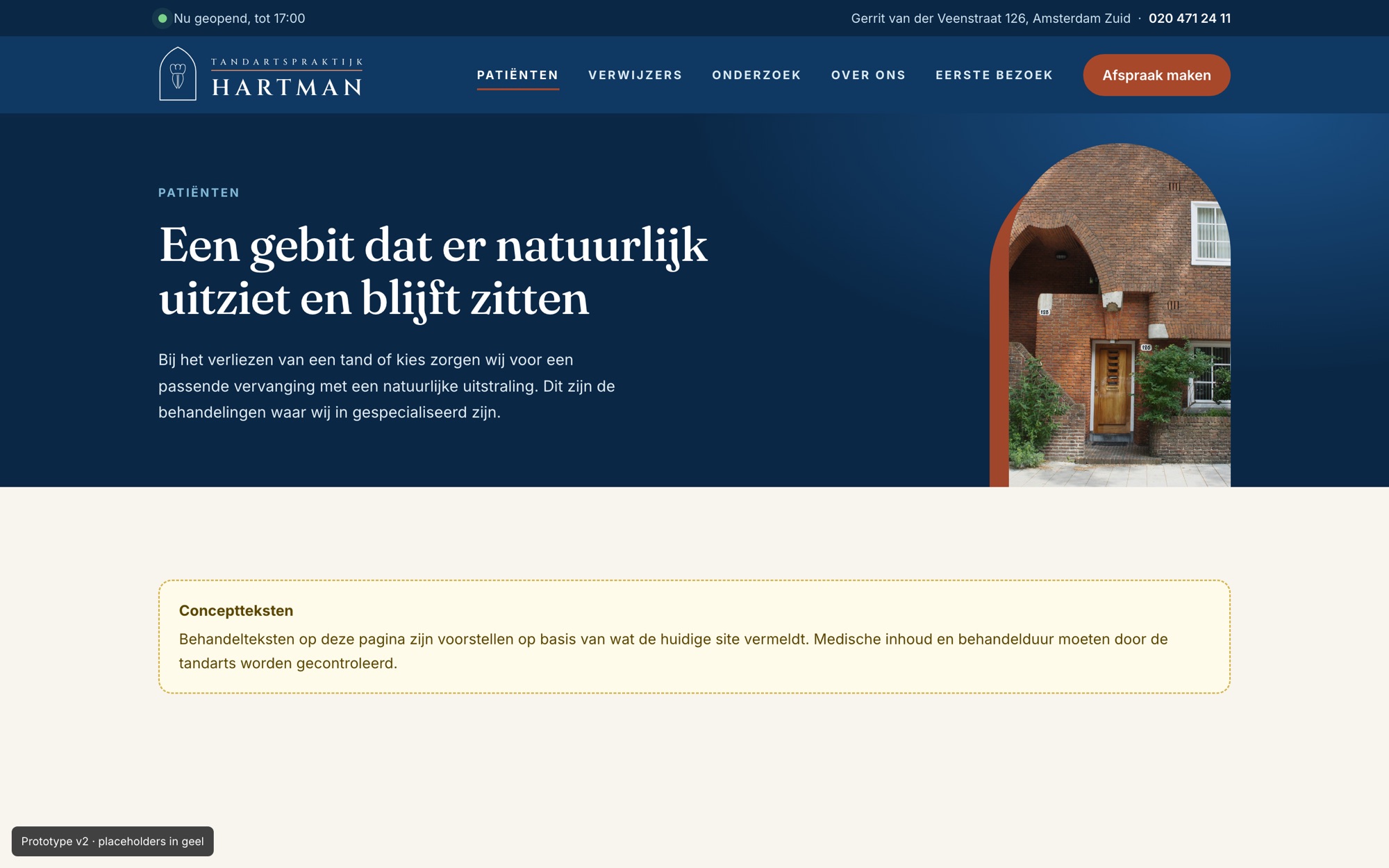
A clickable concept with homepage, patients, referrers, first visit, a treatment page, research and about. Everything still to be confirmed is marked in yellow.
AI in my process
Careful, as healthcare should be.
AI helped audit the site and build the concept. I don't invent medical content: the dentist reviews it.
- Step 1
Audit
The live site checked, with evidence per finding and what's still assumed.
- Step 2
Concept
A clickable prototype with the real address and opening hours.
- Step 3
Yellow = unconfirmed
Everything not yet confirmed is marked, so nothing invented passes as fact.
- Step 4
Logo
Three directions for a logo that also works on a light background.
Photos, cases and the review need consent before this concept is used publicly. Medical copy is reviewed by the dentist.
Outcome
Where it stands.
- An audit with ten priorities and platform advice
- A clickable seven-page concept on desktop and phone
- A dedicated route for referring dentists
- A logo proposal based on the building's doorway arch
Before we build
I'd test the two routes with three patients and two referring dentists before the copy is final. And the booking flow depends on which agenda system the practice uses, so that's the first thing I'd ask.
Contact
Your website back up to date too?
Let's talk.
An intro call takes fifteen minutes, no strings attached. Or just call: +31 6 46 28 62 00.
hallo@studiorttr.nl